Hamilton Standard Prop Logo on P-51s?

Ad: This forum contains affiliate links to products on Amazon and eBay. More information in Terms and rules

von hahn

Airman 1st Class
141
21
Aug 2, 2008
JNB
Hi all,

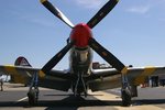
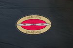
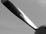
A quick question...Did the Hamilton Standard logo found on the propeller blades of P-51s during WW2 have a gold background, or a yellow one? Reason being that in almost ALL the decals released for P-51s,including the outstandingly accurate Aeromaster decals, the logo is yellow and red,(except for the decals supplied with the 1:48 Monogram P-51D, which is gold and red),but I am an airline pilot and our ATR42s also have Hamilton Standard props, and the logo on those is, like the Monogram kit's decals, gold and red.So now I'm confused...GOLD and red, or YELLOW and red???
 
Hi Von Hahn,
The logos I've seen are usually gold and red.

I have a better photo of the logo (at home), but I'm at work at the moment, so I'll have to use a photo I posted in another thread that has a good view of the logo (I know it's a B-17, but it's identical). When I get home this evening, I'll dig up the photo with the detailed shot of the logo and post it for you.

92694.jpg
 
I've just checked a series of colour shots from WW2, in Roger Freeman's 'The Mighty Eighth in Colour', and can confirm that the background oval was gold. I'll admit though, in some shots, possibly due to the angle and lighting, it does appear yellow.
I vaguley recall hearing/reading somewhere that it might have originally been yellow, changing to gold after an anniversary of the company, but I can't verify the accuracy, or otherwise, of this possibility.
 
As promised, here's some good photos showing the Hamilton Standard prop label.

First photo is a PT-51C showing the four labels and if you'll note, the sunlight on the label on the upper-left prop makes it look a sort of "goldenrod" (yellowish) color.

The second photo is a closeup of the label on the prop of a B-17G. (A different one than the one pictured in my first post). So the colors are pretty consistant between the label applications. For this photo, I turned the camera sideways for the closeup, it was on the lower (6 O'clock blade).

Hope these are of some help! :thumbleft:
 

Attachments

  • IMGP6872-rs.jpg
    IMGP6872-rs.jpg
    88.5 KB · Views: 269
  • IMGP6907-rs.jpg
    IMGP6907-rs.jpg
    76.8 KB · Views: 384
Nice pics Dave. Although the evidence from WW2 pics shows gold, and the currenntly used logos (on restored warbirds and modern aircraft) are gold, I wonder if there is anything in what I heard about them being yellow at one time? Be interesting to find out.
I presume decal manufacturers (for models) take the easy option, and print a 'solid' colour, rather than use a specialist metallic ink for such a tiny area, hence the yellow decals, unless they genuinely believed the logos to be yellow.
 
Thanks Terry!

When I was posting these last night, a thought occurred to me, and that was perhaps the color quality of photos back then may have created a yellowish hue to the gold labels and/or the color interpretation of B&W photos may have lent to the thinking that they were yellow?

I might play with the top of the last two photos in Black and White to check the B&W theory. If you'll notice, the label on the upper left prop is much brighter than the other three (because of the sun)...now compare the hue of that label to the yellow on that same prop's tip. Looks real close, doesn't it?
 
Last edited:
Thanks for the info, Graugeist! Fantastic photos! Yeah, the logos on the B-17's prop blades are identical to our ATR 42s,with the gold and red! I'm also wondering, now that it's been mentioned, if the yellow/red logo wasn't an early version, superceded by by gold/red later?...
 
You're welcome!

I'm also wondering, now that it's been mentioned, if the yellow/red logo wasn't an early version, superceded by by gold/red later?...
Like I commented up there, regarding Black and White photographs, alot of times, colors have been mis-identified because of similiarities (or poor quality) in shading.

I took a copy of the original and cropped it to the left prop area, where the sunlight lightened the label. I desaturated it, to a true B&W finish. Now if you look at the label, the gold area is actually brighter than the yellow clearance band on the prop's tip...which is a true yellow. This effect could easily be mis-interpreted as being a yellow band rather than the gold in vintage photographs.

But, we can keep digging around for vintage color photos just to be on the safe side. I may even look through some Pacific Theater color photos and see if I can find a good image of a label. Couldn't hurt :lol:
 

Attachments

  • IMGP6872-crbw.jpg
    IMGP6872-crbw.jpg
    51.4 KB · Views: 192

Users who are viewing this thread

Back