VF-17 Corsairs (a WIP)

Ad: This forum contains affiliate links to products on Amazon and eBay. More information in Terms and rules

chicoartist

Airman 1st Class
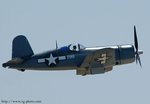
Just did this little guy today ... not the oil sketch I was going to do this size, but I still had a couple of "issues" I needed to resolve via pencil study. Next up is a larger, more refined pencil study - after I finish the detailed outlines for both planes.

Study for "VF-17 Corsairs" (working title)
4.5 x 6 inches
Pencil on 100 lb. Bristol

The final canvas will be 24 x 32.

Corsair_small_pencil_comp_web.gif


Wade
 
Thanks for the comments - good and not so good always welcome here. Means you guys are paying attention!

I must remind you, however, that the entire image of *this* study is about the size of a standard 4 x 6 inch photograph! You know, like back in the day when you used to have your, uh, what's it called . . . oh yes, 35mm FILM developed.

Accordingly, my thoughts while working on this study were confined to: "Lights here, darks there - how does it look when I squint my eye?". If I didn't like what I saw, I added dark here, or erased there. Exact shapes (or perfect ellipses on national insignia) were not sweated over for more than 10 seconds each.

I was mainly trying to 'capture' the main Corsair - the wingman was "blocked in" in about 2 or 3 minutes. As I said, I haven't even completed a final, refined, outline for both planes. THAT'S when I'll sweat perfect ellipses and exact shapes.

Not making excuses so much as explaining for those interested what's going on.

Wade
 
Looks good Wade, but what I see is that it looks like the vertical stab is a little far back. It almost doesn't look right how far forward it is on the real thing. See where it is compared to the horizontal stab in the picture. If you need other angle shots, let me know.
 

Attachments

  • DSC_2961.jpg
    DSC_2961.jpg
    24.5 KB · Views: 234
From this (for direct comparison) ...

Corsair_small_pencil_comp_web.gif


After one aborted attempt in oil, I reset the DG and am now much happier with the "direction" this one is taking.

The background of the first (6-inches wide) color study was in a dominant lower key, to help "pop" the Corsair, but I just didn't like it (I'm trying to be the best Wade Meyers, not the second-best Bill Phillips!), so I grabbed a 9 x 12 canvas panel I had primed a while back, used the 9" side as the width, and cut off the "height" at the same aspect ratio as the final planned 24 x 32 canvas.

This study is 6.75 x 9 inches, oil on panel. I'm counting on the red surrounds to the national insignia (and the red prop hub) to add a bit of color. Notice that the wing insignia is sans red surround. I'm going to let the paint dry a wee bit before I smear some red in there.

The final art will have both canopies OPEN (I think). I hope to get a bit of "driver" in there with his sleeves wind-whipped.

It's tough for me to do, but these smallest of studies are part of the "weeding-out" process - thank goodness I didn't invest much time in the original (aborted) oil study - best to figure things out before I'm too committed . . . thus, the emphasis here is on basic color and value - not detail. The best way to avoid getting too involved with detail is to make them quite small:

JR_9_inch_study_Canon20D_web_2.gif


Wade
 

Users who are viewing this thread

Back