- Thread starter
- #21
Navigation
Install the app
How to install the app on iOS
Follow along with the video below to see how to install our site as a web app on your home screen.
Note: This feature may not be available in some browsers.
More options
You are using an out of date browser. It may not display this or other websites correctly.
You should upgrade or use an alternative browser.
You should upgrade or use an alternative browser.
Practising Paintshop/GIMP...
- Thread starter Marcel
- Start date
Ad: This forum contains affiliate links to products on Amazon and eBay. More information in Terms and rules
More options
Who Replied?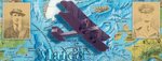


- Thread starter
- #23

Thorlifter
Captain
I like the text on #19. Nice work Marcel.
- Thread starter
- #26
I like the text on #19. Nice work Marcel.
Thanks Thor and Wurger. I will try to practise with text in the future. Seems to be my major flaw when making these things. Wojtek has a much better eye for fonts. But luckily he's a great teacher. Otherwise I'll stick to making a composition and ask him to do the text
")
- Thread starter
- #28
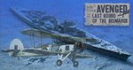
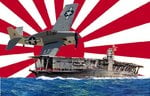
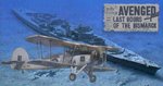
Okay, the following are no siggies (should I make a thread in the personal gallery forum?) or at least not jet. Just me playing around with themes, making a composition (and avoiding text  ) and using several techniques.
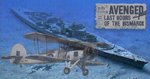
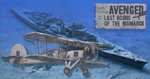
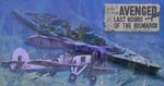
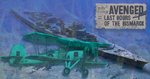
1. Bismarck lying on the seabottom, with a ghost stringbag. Tried to make the edge of the nespaper a little erroded, like old paper. Curling the edge in Paintshop pro is ugly, tried it, but it looks too artificial.
2. Midway, flightdeck Akagi steaming with a wildcat. I wanted to see what it looks like if you throw perspective overboard.
Attachments
Cool Marcel,
I like them both.But the first one with Bismarck I like much.However it would be looking better if the transparency of the Swordfish at the battleship fuselage area would be equal zero.I mean the part of the fuselage shouldn't be visible.What is more I would suggest to convert the pic with the plane into sepia one and then use here.It could take a correcpondence to the newspaper.
I like them both.But the first one with Bismarck I like much.However it would be looking better if the transparency of the Swordfish at the battleship fuselage area would be equal zero.I mean the part of the fuselage shouldn't be visible.What is more I would suggest to convert the pic with the plane into sepia one and then use here.It could take a correcpondence to the newspaper.
- Thread starter
- #30
- Thread starter
- #32
Nope, I left the transparency on where it has the sea bottom as a background. I think it gives it a nice ghostlike look. I made the part over the ship solid, but you can just see the beginning of the hull, but very faint. Did some shadow as you suggested.
Attachments
- Thread starter
- #34
Good eye, I thought you didn't notice. I have to change the newspaper's shadow, but didn't do it jet
- Thread starter
- #36
Lucky13
Forum Mascot
Nice work Marcel!
I agree ,very nice Marcel.
And I thought that an very interesting effrct could be if you could make the Swordfish pic not only a sepia one but using the blue colour range.In another word instead of sepia , the blue.I wonder how it would be looking like.
And I thought that an very interesting effrct could be if you could make the Swordfish pic not only a sepia one but using the blue colour range.In another word instead of sepia , the blue.I wonder how it would be looking like.
- Thread starter
- #39
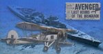
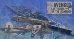
Okay, I had to figure out how this works in Paintshop pro, but let's see: I overdid it a little to see the effect. First one is done with the red/green/blue effect., enhancing blue, the second one with the Channel mixer, god knows what the difference is. You see quite a difference in effect, the first staying much more close to the sepia effect and is much more subtile, while the second one gives a blue-greenish effect.. Some shadows/fades don't work out well (see cockpit) I'll have to try and correct this.
Attachments
Hi Marcel,
The second effect is not good.The green colour doesn't match.The first one looks much better but I would suggest to get a sample of a blue ( the dark one for instance) colour from the background.Or use a range made with these background blue ones.
The second effect is not good.The green colour doesn't match.The first one looks much better but I would suggest to get a sample of a blue ( the dark one for instance) colour from the background.Or use a range made with these background blue ones.
Users who are viewing this thread
Total: 1 (members: 0, guests: 1)