109ROAMING
2nd Lieutenant
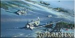
Hi everyone
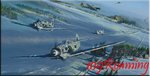
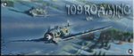
Can someone please make me a signature
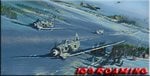
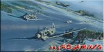
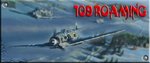
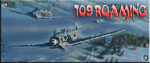
possibly outta this?if its not copyright or anything

I've tried playing round with photoshop but it's more complicated than level 2 physics
Thanks in advance
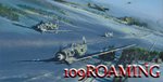
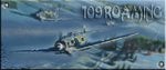
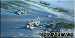
Can someone please make me a signature
possibly outta this?if its not copyright or anything
I've tried playing round with photoshop but it's more complicated than level 2 physics
Thanks in advance