
Navigation
Install the app
How to install the app on iOS
Follow along with the video below to see how to install our site as a web app on your home screen.
Note: This feature may not be available in some browsers.
More options
You are using an out of date browser. It may not display this or other websites correctly.
You should upgrade or use an alternative browser.
You should upgrade or use an alternative browser.
Official Sig / Avatar test Thread (5 Viewers)
- Thread starter Medvedya
- Start date
More options
Who Replied?

Lucky13
Forum Mascot
New siggy a' la Marcel....

Aussie1001
Staff Sergeant
Sorry wurger i didn't get that.
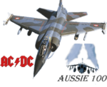
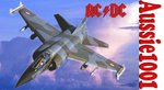
Well i've done this in it, bearing in mind that i've had it for about a week and only used the blurring tool and the magic wand i don't think it's too bad.
if anyone's got tips they would be greatly apriciated. Personally i think i have been a bit to heavy on the bluring tool....
Thanks.
And Lucky the siggie looks great.
Attachments

Aussie1001
Staff Sergeant
I'm a fan mate.
Aussie1001
Staff Sergeant
Do you think that the blurring is a bit much ?
and is says assie 100 instead of 1001 must have cut it off.
and is says assie 100 instead of 1001 must have cut it off.
I'm a fan mate.
Now it is clear.
 Too heave for me.
Concerning the pic, the main aircraft looks good and the ACDC font aswell.Very nice tonality of the red colour you have gotten for the font.
But the Harrier is unnecessary, I think.And of course your nick should be corrected,Mayby another composition should be considered.

\
And Lucky the siggie looks great.
That's Paintshop pro. Not as sophisticated as Photoshop, but really easy to learn.
Aussie1001
Staff Sergeant
Compisition ?
Aussie1001
Staff Sergeant
so move the pics around a bit or add new ones in ?
I'll have to wait Fireworks is on my PC.
I'll have to wait Fireworks is on my PC.
Aussie1001
Staff Sergeant
ok thanks will do.
Thanks Wurger 
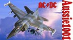
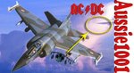
Of course the Harrier has his own layer I thought about placing the harrier there, but I think it'll be too crowded having the ACDC sign there as well. The ACDC was placed there to mask that the Mirage doesn't have a fin. Leaving out the Harrier would be best, I think. The objects are too much blurred, unfortunately.
Of course the Harrier has his own layer
I thought about placing the harrier there, but I think it'll be too crowded having the ACDC sign there as well. The ACDC was placed there to mask that the Mirage doesn't have a fin. Leaving out the Harrier would be best, I think. The objects are too much blurred, unfortunately.I understand you totally.But the Harrier looks like the thing hanging underwing.That's way I suggested its moving to another area.What is more the fin can be "repaired" by cutting off some its part and paste as the next layer for correcting of the aircraft part.Then the name of the ACDC group can be moved right to show whole plane.Of course these correction are quite minor and the siggy looks really great.
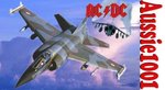
My suggestion would be removing the harrier. I'll try that when I get home.
Users who are viewing this thread
Total: 6 (members: 0, guests: 6)


