- Thread starter
- #161
Navigation
Install the app
How to install the app on iOS
Follow along with the video below to see how to install our site as a web app on your home screen.
Note: This feature may not be available in some browsers.
More options
You are using an out of date browser. It may not display this or other websites correctly.
You should upgrade or use an alternative browser.
You should upgrade or use an alternative browser.
Practising Paintshop/GIMP...
- Thread starter Marcel
- Start date
Ad: This forum contains affiliate links to products on Amazon and eBay. More information in Terms and rules
More options
Who Replied?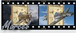
- Thread starter
- #162
VALENGO
Senior Airman
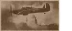
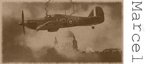
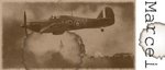
Nice concept and work, but now is all pale blue over here! 
- Thread starter
- #164
- Thread starter
- #166
Yeah that looks nice. I agree with Wojtek though as well on the font. Perhaps a more Gothic looking font would fit more in with the theme of the sig.
bobbysocks
Chief Master Sergeant
these are cool. how much does it cost to get one made?? I'd really like one.
- Thread starter
- #170
What it costs? It costs time, for you to find so pictures and for one of us to make it. What do you have in mind?
What do you have in mind?
Last edited:
bobbysocks
Chief Master Sergeant
cool! i would like dad's 51...with maybe the pic of him in the cockpit and the 364th sq logo...and of course Bobbysocks. i have all the pics and could send them to you in a few days when i get back in town if you wish. thank you very much, marcel.
- Thread starter
- #172
Hi Bobby,
Best thing to do is start a thread, here in the Signature section, with your idea's and pictures. There are a few of us who like to make such siggies, so we can all take a shot at it and you can just pick what you like.
I'll be away for the weekend, so no hurry.
Marcel
Best thing to do is start a thread, here in the Signature section, with your idea's and pictures. There are a few of us who like to make such siggies, so we can all take a shot at it and you can just pick what you like.
I'll be away for the weekend, so no hurry.
Marcel
- Thread starter
- #173
Yeah that looks nice. I agree with Wojtek though as well on the font. Perhaps a more Gothic looking font would fit more in with the theme of the sig.
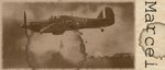
Don't know, tried several fonts, but I really like the typewriter font which I weathered in my siggy. It looks like it came from a WWII era letter or report ore something. I'll stick to this one for the time being.
Yeah, that font works nicely as well. Was just throwing out some more ideas. Perhaps the bit with the text on it could be more yellowed to indicate aged paper in a similar way to the photo but not to the same degree.
GrauGeist
Generalfeldmarschall zur Luftschiff Abteilung
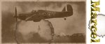
Lookin' pretty good, Marcel.
I like Gnomey's idea of adding a little yellow to the border to show some age to match the image.
(I like the typewriter font, though...works perfect!)
I like Gnomey's idea of adding a little yellow to the border to show some age to match the image.
(I like the typewriter font, though...works perfect!)
- Thread starter
- #176
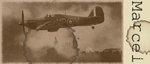
Thanks guys, I agree, the white is a little too white. Hopefully better now? Still trying to get the effect wrinkle of the paper in GIMP. Post later, maybe..
wheelsup_cavu
1st Sergeant
Looking nice Marcel. Good luck on the wrinkled paper effect.
Wheels
Wheels
GrauGeist
Generalfeldmarschall zur Luftschiff Abteilung
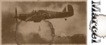
Hey Marcel,
Perhaps if you used an image of wrinkled paper beneath your white (yellowed) margin, and played with layer's opacity (and the color scale) until you get the desired effect?
I have a few paper tiles that are usually used for tiled backgrounds, I'll post 'em here for you. Hopefully these'll be of some help to you!
Attachments


- Thread starter
- #180
A bit of tweaking to get it right, but I now have a subtle wrinkle in the paper. To see the differences, see post 164 I really love this Gimp, it really is much better than Paintshop. I'll probably start a new Thread called "'practising GIMP' 
Users who are viewing this thread
Total: 1 (members: 0, guests: 1)