Navigation
Install the app
How to install the app on iOS
Follow along with the video below to see how to install our site as a web app on your home screen.
Note: This feature may not be available in some browsers.
More options
You are using an out of date browser. It may not display this or other websites correctly.
You should upgrade or use an alternative browser.
You should upgrade or use an alternative browser.
Thoughts for a new siggy
- Thread starter Thorlifter
- Start date
Ad: This forum contains affiliate links to products on Amazon and eBay. More information in Terms and rules
More options
Who Replied?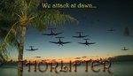
Njaco
The Pop-Tart Whisperer
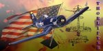
I really like it except for the fonts - alittle too Willy Wonka maybe. Need something bolder.
Lucky13
Forum Mascot
I agree with NJ, great pic though!
Catch22
Major
The thing about the font is that the whole subject is about attacking. When I think about attacking that font doesn't come to mind, though I know why you used it. I'm with the guys, use a bolder, more harsh font.
Freebird
Master Sergeant
Great Pic though!
Well not being an expert......Looks great but I have to agree the font needs improving..I think!
Catch22
Major
Also, soften up the edges of the picture or put a border around it, that may also help, but I love the concept.
- Thread starter
- #9
Thorlifter
Captain
Catch22
Major
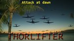
Hmm. Try blending the "Attack at dawn" text in a bit, and also maybe make it a darker shade of yellow. Would it be possible for you to upload the .psd so I could have a look at it?
- Thread starter
- #11
Thorlifter
Captain
- Thread starter
- #12
Thorlifter
Captain
Catch22
Major
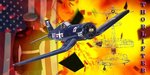
I like the concept! What I would do is use a real plane (like the one that was in my old signature, it was taken at a similar angle) and dull the fire down just a bit by throwing a black and white gradient map over top of just the BG, nothing else though, or you'll darken the whole thing.
- Thread starter
- #14
Thorlifter
Captain
Catch22
Major
That is much better!
Njaco
The Pop-Tart Whisperer
I still like the one at the beginning of the thread. The one you just posted is great but I'm partial to the first.
How about switching the type ...'Thorlifter" on top with a lighter or brighter color and "Attack..." at the bottom, more like a quote...
"We attack at dawn!!"
Still, both are great!
How about switching the type ...'Thorlifter" on top with a lighter or brighter color and "Attack..." at the bottom, more like a quote...
"We attack at dawn!!"
Still, both are great!

Still like the first one but the lightened second one is damn good too!
Users who are viewing this thread
Total: 1 (members: 0, guests: 1)