Navigation
Install the app
How to install the app on iOS
Follow along with the video below to see how to install our site as a web app on your home screen.
Note: This feature may not be available in some browsers.
More options
You are using an out of date browser. It may not display this or other websites correctly.
You should upgrade or use an alternative browser.
You should upgrade or use an alternative browser.
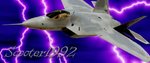
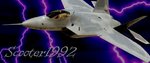
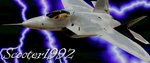
Scooter's new siggy
- Thread starter ScOoTeR1992
- Start date
Ad: This forum contains affiliate links to products on Amazon and eBay. More information in Terms and rules
More options
Who Replied?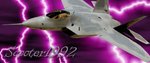
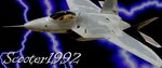
I like the fonts, but I hate the lightnings in the back.
GrauGeist
Generalfeldmarschall zur Luftschiff Abteilung
Scooter, I have to agree with Marcel, the lightning's brightness takes away from the fighter...perhaps darken the lightning bolts down a little?
Otherwise, it's looks great!
Otherwise, it's looks great!
- Thread starter
- #4
ScOoTeR1992
Senior Airman
- Thread starter
- #6
ScOoTeR1992
Senior Airman
thanks man will do tomorrow after work cause i gotta go to bed now
Airframes
Benevolens Magister
Agree with Wurger and all. Bottom one better; maybe 'neon' the lightning and brighten the font slightly?
Cut some good Z's!
Cut some good Z's!
Njaco
The Pop-Tart Whisperer
Lightning is great! I would change the font to stand out more against the rest.
- Thread starter
- #10
ScOoTeR1992
Senior Airman
GrauGeist
Generalfeldmarschall zur Luftschiff Abteilung
I like the top one best!
Making the text a little lighter sure makes a world of difference, so did the adjustment to the lightning.
Making the text a little lighter sure makes a world of difference, so did the adjustment to the lightning.
- Thread starter
- #12
ScOoTeR1992
Senior Airman
thanks for the help guys much appreciated with the criticism
Njaco
The Pop-Tart Whisperer
ahhhh, some color to the old place! Cool Scooter!!
- Thread starter
- #14
ScOoTeR1992
Senior Airman
YAY i'm a trend setter
Very nice mate, very nice!
Airframes
Benevolens Magister
That's how I visualised it! Looks great!
- Thread starter
- #18
ScOoTeR1992
Senior Airman
Ok guys I'm going to follow in Marcel's footstep and I'm going to start practicing more with photoshop. I think I'm going to keep the siggy I got for a while and I'll keep practicing with modern day fighters for now anyway
Attachments


Great attempt, Scooter  Maybe try to give the F15 a little shadow. I would like to see what it does. Don't overdo it though.
- Thread starter
- #20
ScOoTeR1992
Senior Airman
i would man but...i kinda deleted the .psd file for it
Users who are viewing this thread
Total: 1 (members: 0, guests: 1)