What idea? Just put up the words ") I'll make another when I have time, this time with an idea behind it.
I'll make another when I have time, this time with an idea behind it.
I'll make another when I have time, this time with an idea behind it.Follow along with the video below to see how to install our site as a web app on your home screen.
Note: This feature may not be available in some browsers.
Ad: This forum contains affiliate links to products on Amazon and eBay. More information in Terms and rules
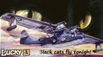
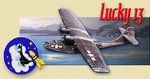
I'll make another when I have time, this time with an idea behind it.Looking good.Can you use another font for Jan's nick? Is there the wind effect available with your graphic application? If it is a Photoshop it should be.Set the effect from left to right to get a correspondence to the water splashes.
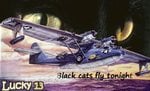
Thanks.Nice work Marcel...!! Would you mind awfully to try to swap the "Dumbo" for the "Black Cat" to see how that would turn out? Given enough time, Wojtek, Njaco and the folks will have to watch their backs...they're getting competition!
Hallo Marcel,
That's it exactly I've meant.And you are right the Photoshop effects can be better, but it can be a matter of settings I think. Anyway the sign looks really much better.
I'm glad I haven't used the pic you did. ...glad i didn't have to choose....