Aaron Brooks Wolters
Brigadier General
Excellent work Evan!

Follow along with the video below to see how to install our site as a web app on your home screen.
Note: This feature may not be available in some browsers.
Ad: This forum contains affiliate links to products on Amazon and eBay. More information in Terms and rules
Get some pics up here more often then Bill!
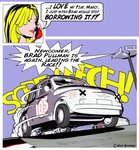
Please do point out any obvious weakpoints or areas that could be improved a little though. View attachment 206520
Some comic relief to contrast Evans superb work!!!!!
Let me know what you think.